

Apple held their annual developer conference yesterday and as was widely expected, introduced a brand new design across their operating systems. They called it their “broadest” design update ever and they are right - never before have they updated the look across so many operating systems at once.
This new design is called “Liquid Glass” and I downloaded the betas on my iPad and test iPhone right after the keynote. I have a few impressions, a few thoughts on the wide ranging reactions on social media and more. So let’s dive in.
Our brain is meant to hate changes
Evolutionary research dictates that in the past, a change meant an “unfamiliar” situation which could mean danger - new threats in the form of an animal or a deadly plant that could be fatal. Over centuries, humans have been hardwired to deal with change aggressively. It is a survival mechanism. This is why a lot of us struggle to make changes to our habits even if it’s for our good. This is why it’s difficult for some people to leave a toxic workplace for example, because they are afraid of what’s next.
So it’s no doubt, that the reaction to the new design wasn’t unanimously positive. I have actually seen a lot of positive feedback online too, some people are absolutely loving the new design and are swearing by it but there are also large groups of people who are keen to point out little inconsistencies, issues and just hate on it as a whole.
Funnily enough, these are the same people who kept clamouring over the years that the iOS design had become stale. Now that they have a new design, the goalposts have changed.
Just an icon pack? Hello again Windows Vista?
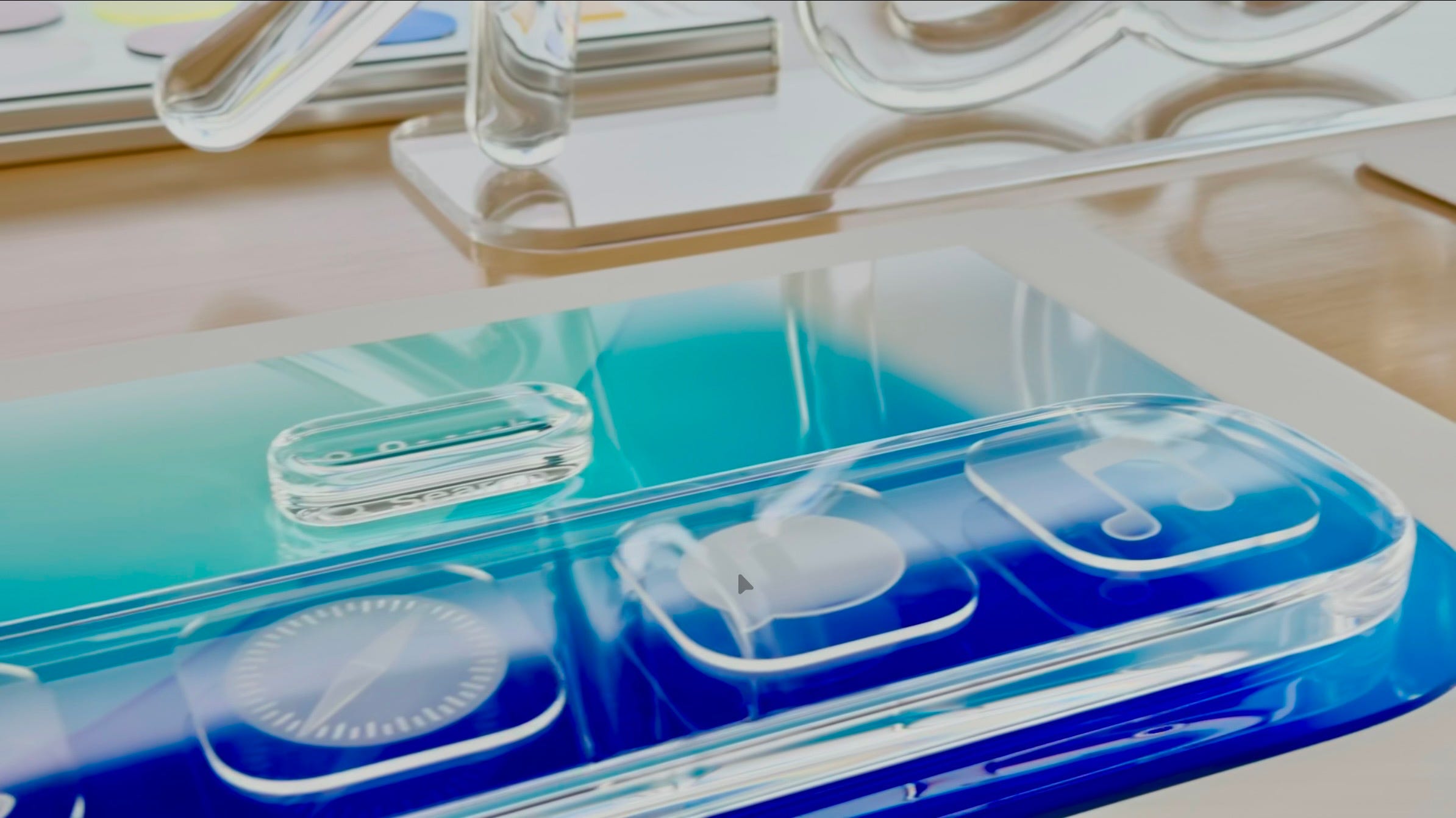
Before I dive more into what has actually changed, if you take a mere look at the screenshots on Apple’s website (like this one above of the macOS widgets), you are bound to find this slightly familiar to the infamous Windows Vista.
This is understandable because Windows Vista also dealt with translucency and glass. But Liquid Glass is a little more nuanced than that. Apple also has the advantage of hardware that Windows Vista sadly did not have. As some would say, Windows Vista was ahead of its time. Achieving great translucency effect while maintaining realism requires good amount of GPU power and hardware, something that PCs in the mid 2000s did not have. Apple devices of today are way more powerful than those PCs and have the ability to do this right for the first time.
Some people have even gone on to simply call this new design as an icon pack with the “glass effect”, saying that Android has been doing it for years. Well, but that’s grossly understating the amount of work that’s gone into this and the way the whole system works. This is not just about simply adding translucency to every button in your app and calling it a day. There’s a reason why designers on Figma are going gaga over how to replicate this without more guidance from Apple. The way the shape behaves to light and content is dramatically different from a mere “clear glass” effect.
So what is Liquid Glass?
Inspired by visionOS, Apple’s designers set out to create a universal design across platforms. They started by taking the material our screens are made of - “glass” and combined it with the fluidity that we expect from a digital experience.
Liquid Glass behaves like a lightweight, fluid, transformative material. There are lots of fun, cute animations sprinkled throughout the OS. But as the name suggests, the foundation for all of these experiences is a glass like substance creating depth and hierarchy.
The result is something that’s truly gorgeous. It builds on some of my favourite fluid animations from the iPhone X gesture system and the Dynamic Island and makes it commonplace across system controls, tab bars and menus.
It also fully embraces the modern devices of the iPhone X era. For the last 7 years, we have mostly used rounded rectangle Apple devices. So why do a lot of our apps look and feel like they are made for normal rectangular screens?
Liquid Glass fully leans into the rounded rectangle aesthetic - tab bars within iOS apps are now rounded and float on their own. On macOS, the windows are now more curved. Apple also says these designs are more in line with the geometry of our fingers, so they feel friendly to touch and interact with.
This new design is also heavily inspired from the refraction of light on real glass. As they showed in the making video, the designers went out of their way to play with physical glass shapes to reconstruct how it should work on a digital device. The result is beautiful refractions of content and light on buttons and controls.
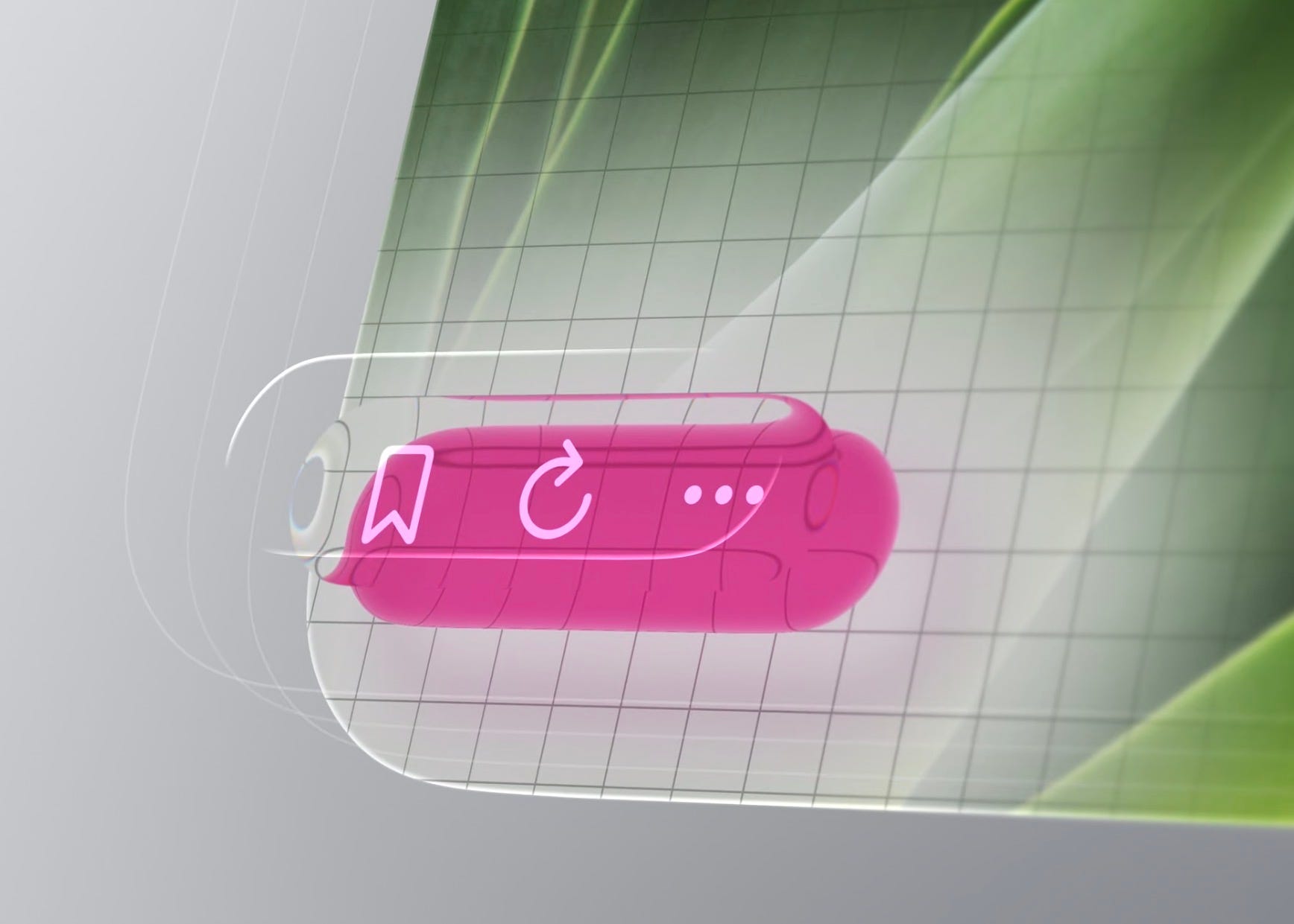
As one example, see the look on this back button as content glides under it.
Another example - watch the “Customise” button pick up light of the wallpaper image above it.
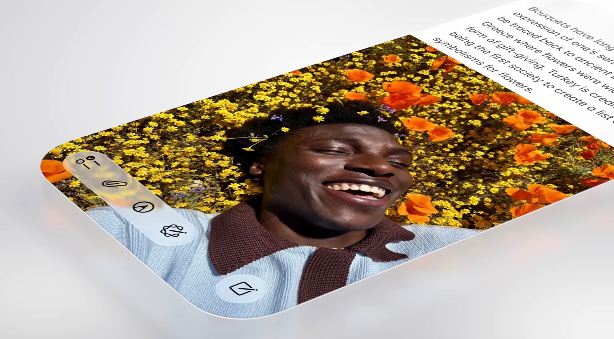
The new OSes are filled with such tiny effects which may not be much on their own but when put together make for something that’s intentional, caring and super fun to use.
The way the colours blend into the glass is also beautiful. So instead of solid coloured buttons, we now have coloured tints that look graceful and subtle. Last year, Apple introduced tinted app icons with iOS 18. At that point, I thought they looked awful and felt not many people would want to use it. But with the new Liquid Glass system, the idea of tinted icons finally make sense. With the glass-effect on the app icons, the tinted effect actually looks pretty neat. Neat enough that I might sport it on some of my devices.
For people who want to make their app icons completely devoid of colour and make it look straight like glass, there’s also a new “clear” effect. I don’t know yet if I like it.
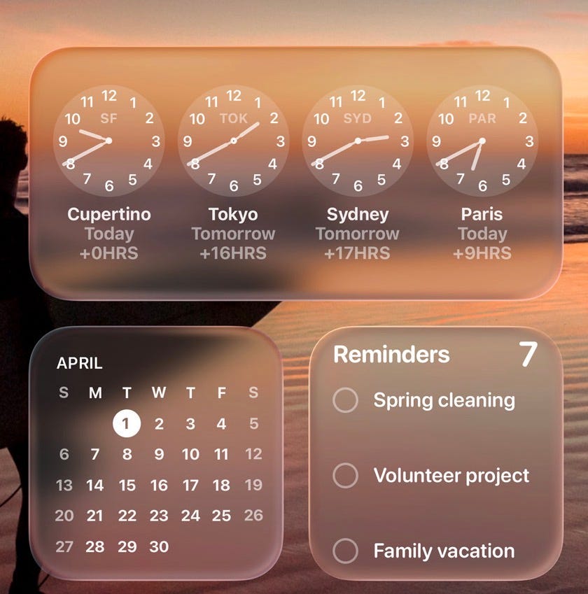
There are also some other tiny, delightful features that I really like - one of them is the new spatial photos in the Lock Screen. You can make an image wallpaper as a Spatial Scene and it almost appears like a 3D image in front of you. The effect is so well done, you really have to see it to believe it. This is like what the Fire phone from Amazon was trying to do years ago, only that this actually works without any additional hardware.
Progressive Complexity
The operating systems (but in particular iOS) also make another interesting choice of surfacing only the most important controls and receding the others until you explicitly need them. You can observe this across the system, like in Safari, where the address bar minimises as you scroll through content and appears when you tap or scroll again. It’s also shown in the tab bar for few apps like Music where the tab bar shrinks when scrolling through content. It’s definitely an interesting design choice. The designers mention that this is done to put the focus on the user’s content and while I agree, there’s some questions as to how comfortable older users would be with such an interface.
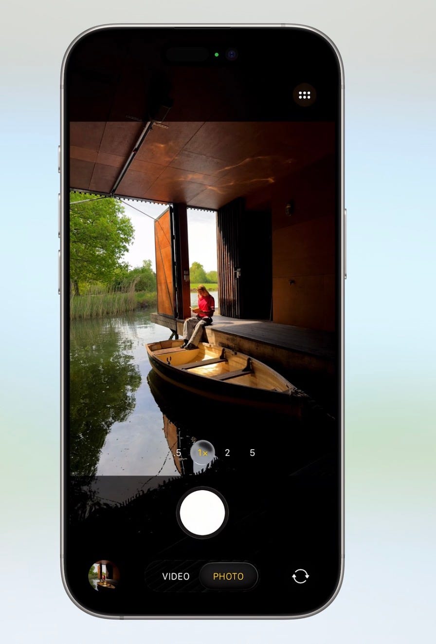
There’s also the camera app which has been redesigned to be as minimal as possible and focus on the two actions that matter the most - photo and video. On the camera app, this redesign makes sense. You could argue that 80% of iPhone users don’t really need to touch the camera settings and would toggle only between the photo and video modes. For the rest of us, well, we would know how to scroll and access those hidden options anyway.
In one of the interviews, Craig Federighi, the VP for Software Engineering mentioned that over the years, they have slowly increased the complexity of the OS so that users gradually adapt to it. This has been evident with the slow addition of customisation features over the years but this is still a dramatic change, so it remains to be seen how users adapt to it.
Oh but no AI (Apple doomed blah blah)
All of these new goodies for us to enjoy and yet it’s a shame that some of us only see what’s missing. I wouldn’t say there was nothing AI-related at all yesterday. Apple did introduce a new on-device LLM model that developers can easily integrate into their apps (and from what I am seeing, developers are already enjoying this new perk!) and they also introduced a bunch of new live translation features heavily built on AI that sound super promising and are on parity with what Google does. Is the new Siri still not shipped? Yes. But that does that mean Apple has lost? No!
I do admit that annual updates suck. Given the pace of AI developments, it would be super cool to see Apple drop new AI features mid-year through the OS cycle with new announcements. But the fact that this WWDC does not contain enough AI announcements does not mean that Apple has lost or that they are doomed. Yes, I get some of us are excited by AI and all the possibilities that come with it (I am too!) but that doesn’t mean we can’t enjoy something that’s not AI related like a beautiful new design, right?
But if you think AI is everything, design doesn’t matter and Google has done AI 100x better on Android (spoiler - all their marquee AI features are also available on iOS / open web, so it’s not really Android specific), by all means, please go ahead and buy a Pixel.
It’s not all perfect (yet!)
A lot of the criticism yesterday and today was for the Lock Screen where notifications are almost unreadable sometimes if your background is too bright and the glass-y notifications don’t adapt to it well. While it is fair, I feel that the criticism has been too harsh. This is just the first developer beta, I am sure the team will fix it over time.
Many people also point out that it’s a readability and accessibility nightmare. This is also fair criticism but only at this point. There’s this amazing talk called “Meet Liquid Glass” by the Apple designers and watching it tells you that the designers already have it all well thought-out. It seems to me more like the engineers are yet to reach the point where the design should be. So it’s going to take a while over the beta cycle where the engineers would slowly adjust the contrast and fix readability issues wherever present.
The talk also covers the different types of glass material available and where each one should be used. It has been thoughtfully designed with the exact problem of readability and accessibility in mind. It’s just the implementation that is yet to reach there. There are also very thoughtfully laid out options for increasing contrast and reducing transparency to make it accessible to people who might find the standard implementation uncomfortable.
Once engineering fixes these issues, I feel Liquid Glass is going to be phenomenal and as Apple describes it - “define our design language for years to come!”
When it releases to the public in September, I am sure there will be haters. When iOS 7 first released, people called it a “soulless” and “thoughtless” design. I wouldn’t be surprised to see the same reactions. But many years later, when Apple is on the cusp of another redesign, we will all look back on this fondly and call Liquid Glass the best thing Apple ever made.
If you liked this essay, subscribe, because I will be writing more WWDC content throughout this week and month. Oh also, while you are here, you might want to check out my previous article about what I learnt about AI from a Rajinikanth movie -
