


Camera. Control?
A study on UI/UX patterns, minimalism and the bridge between the two


A foundational ethos of the Steve Jobs-Jony Ive Apple era was a deep focus on minimalism. For those of you who don’t know Jony Ive, he was Apple’s Head of Design from the late 90s till 2019. If you ever owned an Apple device during this period, he and his team designed it. He is celebrated as one of the best designers on the planet and for good reason, his designs have influenced the tech industry as a whole. In cahoots with Steve Jobs, Jony Ive’s razor sharp focus on minimalism came down to one thing - keep it as simple as possible for the user.
Now, this has resulted in some phenomenal user experiences. This pair is the reason why Apple devices are so easy to use. Around 2013, a little after Steve Jobs passing, Jony Ive also took over the design of iOS. This resulted in the revolutionary iOS 7, a stark design change bringing in the era of flat icons, translucency and perspective wallpapers. This influenced the rest of the tech industry too and everyone followed suit. A lot of companies have even changed their logos now to represent flatter icons.
A lot of people hated iOS 7 at launch and some still proclaim that the pre-iOS 7 era was the best era of iOS. I am not one of them. I loved iOS 7 and I love all the minimalism that comes with it. But I am an Apple purist, an enthusiast, perhaps a cult member even. So it wouldn’t be right to hold my opinion on iOS design to high value. What about the general public? How do they handle all the minimalism on iOS?
Of late, I have noticed two patterns that suggest to me that while minimalism on iOS is great, it could definitely do with some level of introspection on how minimal it wants to be. Maybe at some point, the minimalism is a bit much? Let’s dive in.
Incident 1 - Flash Shenanigans
The iOS camera app is designed to handle all lighting scenarios on its own without much manual intervention. This is one of the reasons why it’s one of the most loved cameras in the world. I remember the first time my mom went on a trip to her hometown with her iPhone 11. She took some pictures in very low-light and she was super delighted to see the results from Night Mode. The photos were looking fantastic and she felt very proud of the photos she had taken. I am sure she would have never figured out how to switch on Night Mode if that was something that required manual toggles.
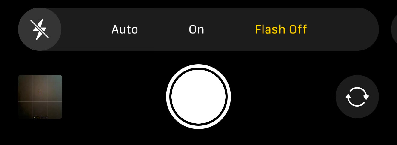
While the defaults are fantastic, the real pain starts when the defaults don’t work well enough. A few weeks back, we were at an office party and wanted to take pictures of our team. I handed my phone to a fellow colleague who enthusiastically clicked a few photos of us. However, the venue had flashing lights and this meant that Night Mode, which is excellent otherwise, was miserably failing in getting the photo to look right. The output was super dull and disappointing. We realized that switching on the flash should help. It had been a while since the last time I had used flash but this seemed like the perfect scenario where the flash could bring out a good photo that Night Mode could not. So my colleague, clicked on the unassuming flash icon on the top left. The icon was previously disabled, and when he tapped, it appeared to have turned “on”. So he clicked a picture only to find out that the output was the same as before. The flash just wasn’t turning on.
He tried a few more times assuming in good faith that it was a bug in the camera app but every photo came out the same way and the flash never turned on. I took the phone and checked the settings and realized that the flash was in “Auto” mode. When you swipe up on the viewfinder, it reveals more options where clicking on flash reveals three modes - Off, On and Auto. Unless the flash is explicitly set to “On” mode, the flash doesn’t turn on. Once I put it in on mode, we were able to get some great pictures.
At first glance, the user experience of the camera app seems fantastic. It makes sense that Night Mode handles everything automatically and the flash is not prioritized but when Apple’s intelligence fails in situations like these, it becomes almost impossible for a layman to figure out how to get things working.
A better way to expose the flash settings would have been to show the Off, On and Auto modes right on the top when tapping on the flash icon. This would have helped clear any confusion on how the flash would work. It would have still maintained the minimalism while exposing the right amount of control in the hands of the user. Having the same icon in two places within the same screen and making them behave differently can get confusing and irritating for users.
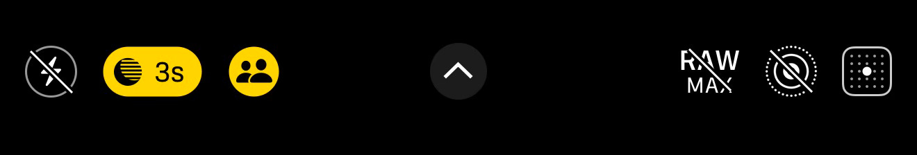
The current system seems to be focused on ensuring everything is done automatically leaving very little control in the user’s hands. This is especially ironic considering Apple also launched the “Camera Control” button this year which is meant to be putting more control into people’s hands. To be fair, the button does expose a lot of controls that are otherwise hidden away from users. The Camera Control gives users the ability to manipulate the Tone and Exposure - two settings that are very difficult to find otherwise in the camera app.
I am sure Apple realizes that at some point, their minimalism went a bit too far. All the recent features like Widget & Lock Screen customization, Camera Control are clearly an attempt to bridge the gap between keeping things simple while still letting power users have control.
Incident 2 - Multiple Languages? Nah, not for you!
I was recently working on enabling multiple languages support for a friend’s app. We added support for about a 100 languages within the app and I was trying to test this. Apple added support for changing languages just for a particular app within the Settings app back in 2020. So I went into Settings, tapped into our app and to my surprise, I couldn’t find an option to change the language. I wondered if I had messed up the code configuration and spent a bit of time going through Xcode settings but nothing suggested an error.
I started Googling around and came across a Reddit thread that pointed out something stupid and unobvious - to enable multiple languages, we need to ensure that the iPhone has more than 1 language added in the General Language & Region settings. The moment I did that, I went back to our app and I could see all 100 languages listed, allowing me to change between them.
The system takes an assumption that someone who uses their iPhone only in English (or only one language) would never want to use their app in any other language. At face value, this seems like a fair assumption. But in the off-chance you want to perhaps use a particular app in your favorite regional language, you are out of luck. The user experience crumbles down and makes the whole process very unintuitive.
I don’t think the Settings screen for a particular app needs to be any minimalistic. Settings is the one place where I expect to reliably configure everything related to an app that I have installed. It’s interesting that the system wants to conditionally show options based on nuances.
This is not a post to bash on decisions made by people, who I am sure, are much smarter than me. I am sure there was a lot of thinking that went into these ideas. This is an opportunity for me and perhaps, you, the reader to introspect design choices if you are into designing or developing apps and websites.
There is the other end of the spectrum as well, like so-called super apps which stuff too much information in one screen and make the app so very unpleasant that I might as well not use their service. What I love about Apple products and services is their ability to consistently deliver great experiences, work most of the times and work delightfully well. It is really difficult to design something at their scale for users of all ages, different cultures and languages. The fact that they do it so well is a reflection of their process. Balancing minimal, beautiful design with an intuitive user experience is an art that needs practice, iteration and a ton of work.
When designing an experience, it is important to start with an idea and keep iterating on it until it becomes simple, stupidly obvious and a delight to use. While doing this, it’s important to ensure it works for everyone, not just for the nerds, not just for the laymen but for everyone. That’s what makes an interaction magical. A design needs to be simple but simple does not always equal minimal. Like Jony Ive says, “True simplicity is, well, you just keep on going and going until you get to the point where you go, ‘Yeah, well of course.’ Where there’s no rational alternative.”